Monday 30 January 2012

14 Week Challange - Twirl

Hi folks, this week we will be working on twirl. So to start off, as always, I started with inspiaration and looked for artists that inspired me. Upon reference, I stumbled upon Will Davies a struggling artist who grew up in 30's and admired the romantic art in the American Magazine. Click here to look for more info on Will Davies.

As a Photographer and a Graphic Designer, I instantly connected with his work because of the emotion portrayed in his work. When he painted people, as a viewer I could feel the emotion between the people. When I try to display my art or photo, I try to look for some emotion within the photographed people.

The Image that catches my attention is the wrap around artwork that he did for Harlequin Magazine. The reason why I chose this as my twirl inspiration was because of Wills love for romance art shows on the painting. In the painting he has nice and bright vibrant complementary colours. The way she is sitting is she is twirled on him, a very realistic style of painting technique. 

So after picking the image, I decided to research and found that leif peng has already described the step by step demonstration work posted on here.


The way Will works is not by thumbnailing right away but thinking of what elements he wants in his head clearly then he puts it on a piece of paper the way he wants it. And once he is done sketching roughly he shows it for proofing. He then starts with the next part of the project by photographing the people in it. In the image above he put his kids on the table with a friends wife as mother and act out a little role. I believe that by photographing the people in, it is easier to show the actual size and proportion of people and the exact emotion that they would feel at the exact moment.

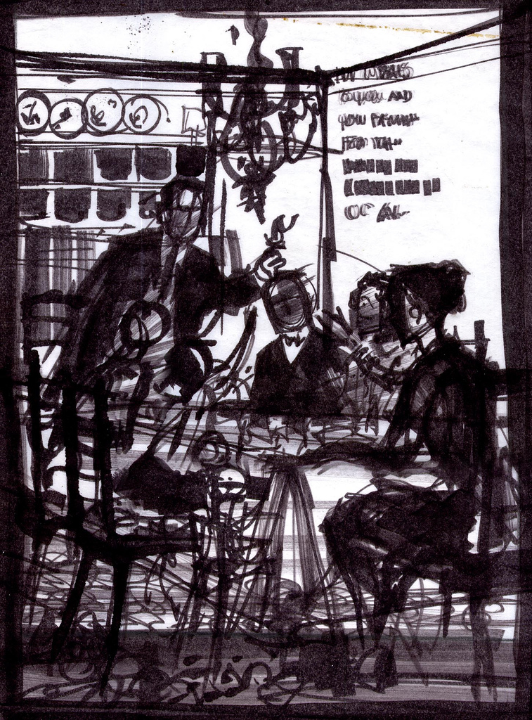
Ive chosen the same path that Will has used. For his thumbnails he used pastels not markers, but since I dont own pastels I will be using charcoal to sketch in thumbnails. 


Once I completed my thumbnail, I went to my next step which is photograph it. I asked my two friends who are now married, to be my models. There is a place nearby in town that has a nice background to it. My thumbnail was drawn because I had already thought of which place would be good to shoot at. Fortunately for me I caught one of the good day to shoot.


So after I got the image I was looking for, I jumped on photoshop and started with editing the photo and adjust the colour. So after I started with drawing in simple outlines and went on from there. Pictures speak larger than words so i'll let the pictures do the talking.


and to add finishing touches to it, i added a forest backdrop to it.
 Time to add some text to it and finish it up. This becomes a 2 page spread of a Womens Magazine.

Till next time Cheers!!

Laptop Skin

So couple weeks ago, I started working on my laptop skin and wanted to make it unique and something cool. So I was looking at some of the laptop skin for macbook pro and they had some cool ideas incorporated with the apple glow at the back of the laptop. I wanted to do the same, so I started with the heroes that haven't been done as a skin and I decided on Green Lantern. At first I wanted to make it so that the ring is inside the hand and its glowing because of the apple but then I realized it will not work out so I had to come up with another idea. My next idea was to simply use green lantern and since he uses his ring to create imaginary objects i will make it so he is imagining the apple logo which looks like this :
I added he green lantern text and put it at an angle so that it works with the proportions and made green lightning come out of the text to give it a cool look to it. At first I wanted to make it all color but then realized that I have a macbook pro hard shell cover which is black in colour. I could've made it colourful but it wouldn't have been as affective as the green glow outlines. The pink outline is just the cut out area of where the apple logo is going to be with the trim marks.
If you want to know the details of how I made the green glow and other things comment me below and I will make another post. Till then Chao!!

Thursday 26 January 2012

Free Wedding photography workshop online!!


Hey guys, I don't know about you but I am a photography frenzy. And I love to learn new techniques and details of what is it that other photographers look for when taking photos. I searched Internet for any information on photography and stumbled upon creativelive.

This is an excellent website out there for any photography tips and techniques. What Creative live does is they bring in well known photographers and other artists who have been successful in the industry and perform a live session. Meanwhile the members of creative live (member of 8 people, and tons of volunteers) come together and make this happen.

Creative live prepares their stuff in advance, they start with finding 5-6 viewers to have a free in class studio time for the whole 3 day seminar. When the preparation is done, they put it online for free so that people like you and I, who are truly interested in getting information can watch it. Thats not all they take their recording and sell it for a variable price from $99 + so that even if you are super busy, you can buy it for a reasonable price.

And from a person who has watched their videos, I say this is the smartest investment you will ever do. The amount of information produced in this is just mind-blowing. I might even go as far as to say this is better than taking co-op in school. Some might even argue this point. What they've done that makes it so special is that they have couple people sitting on the computer asking your questions relevant and related to what you might have asked if you were really there.

Tomorrow on 27th Jan 2012, Creative live will go live from 9:00am to 4:00 pm pst for the next three days they have invited Zach and Jody Gray, professional wedding photographers. They will be in a real wedding scenario and will go through of how to take images and what little things you can do to improve your own skills.

To watch it live go to http://www.creativelive.com/live
See you there!!

Monday 23 January 2012

IWD - Week 2 - Update

Today I continued working on Mother Teresa. I created a sketch of how i want things to look with the full text and also experimented with color schemes. But as of right now, I dont know which direction I should be going towards. If you have any suggestions feel free to comment.
Started sketch on 18 x 24 approx.

Color comps:
Feel free to comment on what I should've changed..
Arios amigo!!

Saturday 21 January 2012

14 Week Challange - Week 2 "Prepare"

Good Morning everyone. Today we will be working with the word prepare as given by Illustrationfriday. To start off I started researching for the word prepare, and found out some ideas of where I can go with this. Because I have chosen photography as my main element to display my art in, I have to choose carefully of what i should photograph. As mentioned in my previous blog, I will be looking at Leif Peng's Artists collection and look for inspiration.

 Inspiaration
From the different artists, I chose Richard Gates as my inspiration. In his artwork, he showed an apple which is very stationary with a bunch of apples in the background and people harvesting the apples. He tried to display texture on the apple and cut out the apple from the frame. For the colours he used complementary colours to make the apples pop. 

Thumbnails
For my thumbnails, I tried to incorporate fruits that are being cut and prepared to be served. But during my thumbnail process, I had an issue with the subject. Looking at an apple is very boring to look at, therefore I had to create something that wil catch the viewers attention but didn't know what that was yet.

Shoot
Knowing that just apples was very boring to look at, I decided to just shoot the apple and thats when i got inspired. I thought back to when I would see those ads about pizza's and saw the nicely cut vegetables falling down. I wanted to create something along those lines. But the issue was that if I were to take an image and make the fruit fall down, it will turn out blurry and plus it will not stay in the form that i want it fall down in. So I had to make something to hold the fruits in its original position. 
The fruits i was using was an apple and a banana, half cut and falling down. I used toothpicks for apple to make it hold it in place. At that point, I knew I had to shoot at a low angle so that i can see the distance between the ground and the apple. And for the banana, I had to use a long stick and stick it from the middle through the cuts and into the remaining of the banana.

Here are the images I produced:

For educational purposes, I will go through my process of photoshoping the image. 
So the first step was to bring it in photoshop. I didn't had to use any color correction techniques because I had already set my white balance to the correct temperature when I was taking the shot. 
So I started by using clone stamp tool and and the spot healing brush tool to take any pieces of toothpick out of the image.
 Before cloning it out

After cloning it out


 Then I used the hue and saturation filter to take out the yellowness of the apple because it had been out for so long and the 1000 watts hot lights made the rotting process faster. Go to the hue and saturation, into the yellow filter and turn down the saturation.

After edit of yellow hue, it already started looking really nice. 
I used the vibrance filter to bring out the colors in the image. It was ok to bring out the vibrance a whole bunch because there were a lot of dark colors surrounding the apple. 
After I used duplicate merged the layer so all the effects on the image are transfered to a new layer merged with the image(Mac: cmd+opt+shift+e)(PC: control+alt+shift+e). Then I used the HighPass filter at 1.6 pixels just so that we can bring back the tiny details.Dont worry if the screen goes into a weird gray scale color because we will be turning the channel into an overlay
Here is the screen shot of all my layers.  


So here it is, the final two images:


These images can be used for Commercial ads with just a little bit of text added to them.
Thanks for joining me, see you next time!

Tuesday 17 January 2012

14 Week Challenge - Grounded Week 1


The time has finally come, it's 14 week challenge. In this challenge, I will be creating images through photography and my graphic design abilities to create something spectacular. 

So the word of the week is Grounded and i started off with researching artists which will help me give inspiration to my final work. For those who feel like you don't know any artists to research here is a link to some of the great designers and artists flickr set provided by Leif Peng.


I decided that Robert McGinnis would work nicely because in his artwork image, one with the women, he creates a high fashion, gentle, and a royal feel to the model. And in his other image, Robert gives definition to the tree. He also uses good use of colours to his artwork, he uses bright vibrant colours and makes elements pop.  
Ive started with thumbnails to get some ideas of how to incorporate the word grounded.


After choosing the tree theme from the thumbnails, Ive invited my model Jen and start taking some images of her in a photo studio. In just a matter of minutes I got my perfect lighting situation and started with my photo shoot. The camera i am using is a Nikon D90, with an aperture of 5.6 at a shutter speed of 160th of a second. And soon I got my image that i was looking for.


After capturing the image, I started using software Photoshop to enhance and turn the image into a human tree with the help of stock images found on free stock websites.


After a lengthy process of photo shopping, i got my final image. Hope you enjoyed this blog and stay tuned for next one.

Monday 16 January 2012

International Women's Day!

"If you can't feed a hundred people, then feed just one." This is a quote from a well known icon who I will be spending next couple of weeks illustrate as a special day is near. On March 8th will be the International Women's Day and I would like to pay a tribute to a special women who was a forigner and was poor. She dedicated her life to helping and feeding the poor in the slum dogs of India. Her name is Agnes Gonxha Bojaxhiu better known as Mother Teresa. 
I started off with thumbnails to see which pieces fit together 
My next transition will be to rough draft with a pencil.
The artwork will be a 18 x 24 inch long, and will be painted in acrylics on a masonite board.
That is all for now, have a good day! 

Sunday 15 January 2012

Week 1 - The Opening Act.

Before we get down to the dirty, let me introduce a little bit about myself. My name is Zoheb Shaikh, a Graphic Designer, Illustrator and a Photographer. I was always interested in drawing since i was a child, but didn't know where i fit in the arts industry. So once i got out of high school, i took Arts and Design Foundation for a year which made me love two career choices, Graphic Design and Photography. It has been almost two years since and I am in my last semester of my Graphic Design diploma. But I still want to brush my photography skills, thus the 14 week challenge.

What is this 14 week challenge you ask? It is a weekly challenge, appointed to improve my Photography and Graphic Designing skills. Each week a word will be appointed from illustration friday and with that word, no matter what meaning comes out of it, i have to illustrate my work. In this blog, I will be posting from the research and inspiration, thumbnails, rough draft, to final artwork. Besides the 14 week challenge there will be other Art work posted on here as well.