Tuesday 17 April 2012

Intention

In this post, I decided to go with the intention to kill as my theme.
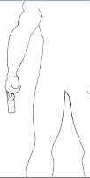
I started off thinking of a way to give it a cool angle. So I decided on making it so the camera is on the main characters legs. I started off with just the outline.
After I made the outline, I started colouring the character, and added some shadows to it.
After the shadow, I added a background to the canvas with a gradient to it. I choose purple because it will complement and give red colour some pop. 
I also added bevel and emboss effect to the character. Instead of having the default black and white, I changed the colour to yellow and orange and changed the mode.
This itself gave a nice effect to the character. After that I created a bad guy in a silhouette form.
And finally, I added a ground for them to stand on so that they are not hovering in mid air.
There you have it, Intention. So here it is the final piece.
INTENTION


Capable


Illustration by René Gruau
In this illustration René Gruau shows a fashion side of illustration but this image gives me an idea of what I can do.
This image reminded me of the good and evil side of humans. In my illustration, I want to portray an emotion. I started off with a gradient canvas on photoshop and just started drawing with the tabloid. 


I think that this image shows good composition and has a sense of balance to it. The image is not ment to have a lot of colours to emphasize the evilness with colours red and black. This image uses a good use of third rule keeping the focus on the first half of the image. Then with the help of using lines in between image, the eye follows down the page, where it meets the caption of the image.

Fluid

Illustrated by CG Evers


This image has a very good illustration of fluids, which is why I chose this image. CG Evers work posted on Leifs blog have some sorts of water form incorporated in his images. The illustration of water is done in detail which inspires me to create something realistic.

For this tutorial I have gone ahead and take an image of a glass with water in a studio and with the help of photoshop, made a path tool around the glass to have a cut out.
To help with my final design, I got help from this link: 
http://www.youtube.com/watch?v=UioEstpPy0Q 
It uses 3d tool so make sure you have a fast running computer.
Using similar techniques, I created water effect on top of the text "water."
And this is the result.


Friday 13 April 2012

Suspense

This week i have decided to go with the artist Ric Grasso


Tutorial: for cs4- cs5 extended or higher

with the background layer go to 3d menu and go to new shape from layer and to go sphere.
It will give you a nice round ball.
 in the 3d layer double click the background layer to build elements to it.
create new blank layer.
Press d for black and white
fill the colour to 50% grey. (Shift + Del)
filter -> Render -> fibers
variations - 16
strength - 12

Go to filter again go to distort and choose polar coordinates.
choose rectangular to polar and press ok.
Select marque opt. +  Shift from the centre of to the edge of the circle. and press command j to bring it to its own layer
and lock the transparency by clicking on the first button next to lock in layers panel.
go to filter -> blur and -> radial blur. zoom it at 30%
go to gradient, radial gradient to be specific to a black to transparency and change the mode to opacity.
start by getting some gradient from the middle so it looks like an iris of the eye. Click it couple of times so you have a good amount.
click the layer and convert it to smart object. and scale it down by clicking shift + option.
Next bring in some colour by clicking on layer style and click inner glow and change it to linear burn mode with a black colour.
click on colour overlay and choose the colour of your choice and change the mode to soft light. click ok and SAVE the changes.
you can close it down.
you will see that the eye is not fitting properly, the easy way to fix that is to double click the background and transform it so its squished from sides. 
Adjust the eye according to your preferences chosen.

you can rotate the eye around by clicking the 3d rotate tool.
go to 3d window and click 3d.
click on the materials section 3rd one one from the top.
click on the icon next to it and choose new texture. set it to the dimensions from original file.
you can see the light added in.
choose the gloss at 75% and shine at around 60%.


Tuesday 13 March 2012

Emotional Labour!

Today I am going to share with you some of my passion, people who I look up to and things that inspire me when I don't feel like being creative. As you know I am a Graphic Designer and a photographer. I create commercial and editorial content through composition and innovation. 
I started learning photoshop by myself and after my high school ended. And as a visual learner I wanted to see people create art work on photoshop. I wanted to learn what tools they used so I can relate to the artwork. Through countless hours on my computer searching for people who created this type of content, I found some amazing artists I can look up to. I will share with you my top 2 artists on this post.

Corey Barker
Corey is a Photoshop Guru. He creates stuff on the side for people inspiring to become good at photoshop. He posts his video tutorials on http://planetphotoshop.com/ and the work he produces is just simply astounding. His tutorials are very simple elements put together. If you are new to graphic designing, follow his tutorials and I promise you, you will learn so many things he has to teach you. 

Deekay (Dongwook Kwon)
As I started to improve, I wanted to challenge myself and set out again to look for artists who were amazing at this and I stumbled upon Deekay, a korean guy from New york. His artwork is something I hope to achieve some day. You can find his work on http://www.deekayart.com/, He doesn't do tutorials but makes speed painting that is worth dreaming for. This is one of his artwork he recently created of Jeremy lin from scratch on photoshop. You can watch is speed painting on http://youtu.be/BHJ0RlRsofw 

These people are on my top two list of thousands of people. What they have started and what I hadn't realized at the time was that they were doing emotional labour. According to me emotional labour is creating content that other people can relate to and feel something through the art, even if it is difficult for you to create. By starting this blog and posting my art, I am one step closer to the artists I look up to. 


As a result, I started making things that other people don't feel like making. Couple days ago, a friend asked me to create a poster for him about Cricket. 
The only information that was given to me was:

Cricket
History: 
The game of cricket has a known history spanning from the 16th century to the present day, with international matches played since 1844, although the official history of international Test cricket began in 1877.

The first ever international cricket game was between the USA and Canada in 1844. The match was played at the grounds of the St George's Cricket Club in New York
Previous winner has been India 2011, Australia winning the last 3 world cups in a row 1999, 2003 and 2007

Sport
There are 3 different formats in Cricket, Test Match, 50 overs and the more exciting version is the 20/20. A Test Match will take a maximum of 5 days and both teams’ bats twice. A 50 over game take roughly 7 hour, and the shortest version take about 4 hours to finish. 

Equipment
Cricket has a lot of Equipment, a proper cricket bat and ball. Batting pads, Batting Gloves, A Hamlet, thigh pad, these equipment’s are only used by the Batsmen, the back catcher AKA wicket keeper wears Wicket keeping Gloves, Wicket Keeping Pads.

Field
A cricket ground is somewhere from 90 meters to 75 meter from the middle of the ground where the cricket pitch is, 75 meters being the shortest. In Cricket, batsmen are allowed to hit the ball anywhere along the field 360 degrees.

Team
A cricket teams consists of 11 players, there are all present on the field at the same time when they are playing defence AKA fielding. A squad can have up to 15 to 18 players.

At first I thought I will give it a background and one or two images but soon realized its not a going to be a poster. The content is not about creating a poster but about teaching how the game works, its an infograph I needed to create. So I googled some of the infographics and got inspired by it and made this. My friends college loved it soo much that they not only wanted to publish it but also wanted to take me to an international trip on a paid expense and take photos for them.
Infograph is about distributing information and transforming it into a visual for other process the information. 

Hope you create your own content and share 

Thursday 8 March 2012

International Women's Day Poster

Hey Guys, so here it is the final International Women's Day Poster that I have been working on for weeks now.


Friday 24 February 2012

500px.com

Gabriele Tenhagen-Schmitz 
http://500px.com/schiwa-rose
Dragonfly:  http://goo.gl/mag/780nS

Chris Miles 
http://500px.com/ChrisMiles
Pointing this way : http://goo.gl/mag/xEbu7